The Challenge
Raven Company Inc needed a unified, scalable logo system to align their global corporate divisions under a single visual identifier.
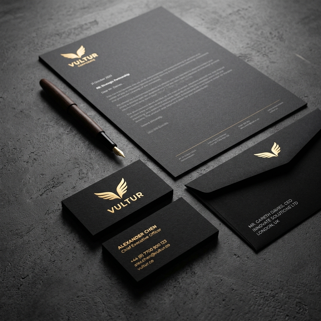
Their old logo was hard to reproduce on different print scales, especially on small envelopes, digital app banners, and large building facades. The typography was unbalanced, leading to inconsistent brand layouts.
Our Creative Solution
We built a new corporate logo mark based on strict golden-ratio geometries, featuring a simplified raven wings emblem vector. We developed custom type adjustments for their wordmark and delivered a 60-page comprehensive style manual covering clear zones, layout rules, and stationery setups.
The core concept combines timeless geometry with modern tech aesthetics, balancing organic flow and structured precision. We established a strict color palette utilizing rich graphite gray and metallic gold accents to represent trust, luxury, and premium delivery.
The Impact
The company successfully unified all global branding assets, saving significant printing and setup costs on corporate layouts while improving visual cohesion across offices in London, Basel, and Tokyo.